Logos are an incredibly important extension of a brand’s identity. As such, you’re likely to see them used in a wide range of different applications. From tiny business cards, to huge signs on the sides of buildings, the possibilities are near-endless.
Because of the sheer number of different use cases, a logo may come in a variety of different formats– each, optimized for a specific situation. Some formats are better suited for digital applications like web design, while others are better suited to the realm of print.
File formats are generally identified by their respective file extensions. Think, example.ai, or example.png. Each extension represents a different format, and as such will need specific apps to either open or edit them.
—
Raster and Vector images
There are two general categories for the images we use for design– raster, and vector images. Either could be used to great effect for a number of purposes, but it’s also worth understanding their individual strengths and differences.
A raster image is made up of pixels laid out on a resolution-dependent canvas. For these file types, information is stored on a what’s called a bitmap. Since everything is encoded to a specific size bitmap, scaling an image down is easy. Scaling a raster image past its original size however, will result in a blurry, pixelated mess. It has its limitations, but you do get the advantage of incredibly detailed photo and manipulation work, so long as you make them to a specific size.
Vector images on the other hand, generate images through the use of mathematical procedures that calculate lines and curves. Since these calculations aren’t set to a fixed bitmap size, they’re free to scale to practically any size you want. These are particularly useful for logo designs, and other uses which may need that endless scaling. Vector images are best used for 2 dimensional work, and flatter design styles.
—
File Formats
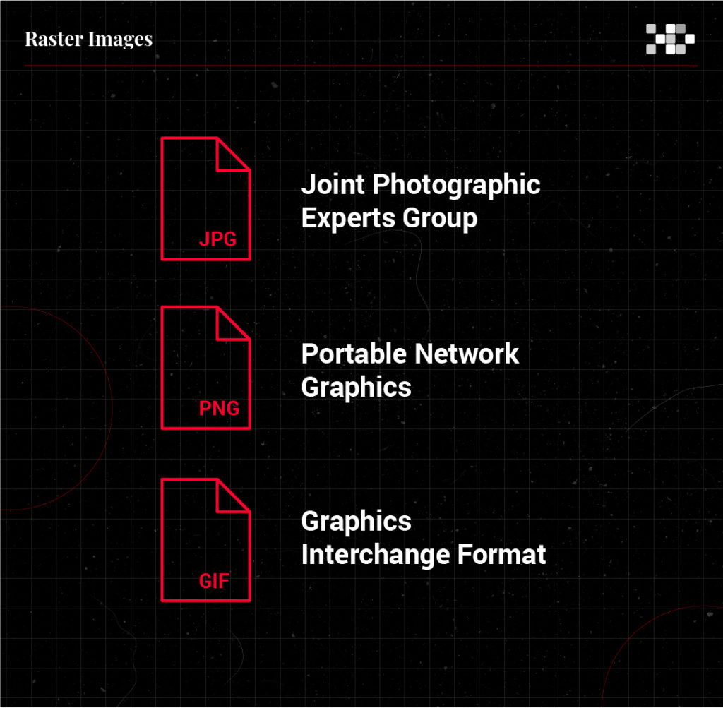
Joint Photographic Experts Group (JPG)
The JPG (sometimes, JPEG) is a format typically used for photography or web assets. These tend to not scale well over their original pixel width, and do not support transparency. Digital use is fine, but you might want to use something else for print.
Portable Network Graphics (PNG)
Another great digital format, PNG supports transparency, and tends to translate particularly well for graphic and typographic use. Like JPGs, these don’t scale over their given size too well, but make up for it overall fidelity.
Graphics Interchange Format (GIF)
Think of GIFs like lo-fi PNGs. There’s a limited color space, but you do get some pretty good benefits like smaller file sizes, transparency, and animation. These are great for websites, and anything that needs a little more animated spice.
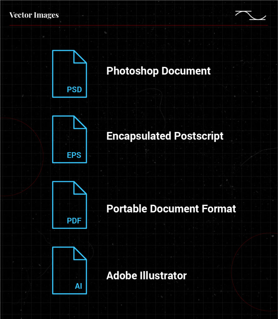
Photoshop Document (PSD)
PSD is the native format used in Adobe Photoshop. This format allows you to save images with masking, transparency, and layer functionality among many others. Much like PNGs and JPGs, you can’t scale them past their initial canvas size without taking a hit in quality. You can, however, preserve all of the necessary information for future edits when you open the file up in Photoshop.
Encapsulated Postscript (EPS)
The EPS format is vector-based, so you’re free to scale images up or down according to your needs. It’s not the latest and greatest, but most print places are likely to have software that works with EPS– whether you use Adobe Illustrator, or an open-source option like Inkscape.
Portable Document Format (PDF)
Another Adobe classic, the venerable PDF is a popular way of rendering documents without having to worry about image quality and legibility. Depending on how the file is rendered, you could even work on various in-document assets after the fact. Pretty neat!
Adobe Illustrator (AI)
Illustrator is the industry standard for vector-based design software, and allows you to draw in a number of different formats. Like Photoshop, AI files are layered, allow for transparency, and scale nicely to your needs.
—
Resolution
Your image’s resolution is based on how many dots there are per inch of content. Magazines and high quality prints tend to use around 300 dots per inch (DPI), while digital platforms tend to use something closer to the ballpark of 75 DPI.
Color Space
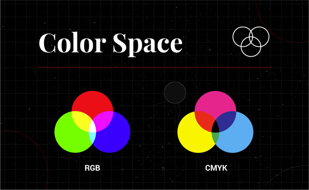
Different color spaces differ in terms of the colors they could reproduce. The RGB color space makes for a wider range of color, and is based on an additive mix of red, green, and blue light. On the other hand, CMYK is subtractive and pigment based– giving you deeper blacks. Some projects may look better in one color space than it would the other.

