
Brands are under constant pressure to make an impression. Every aesthetic choice you make says something about your brand, so it’s important to get it right the first time. Small decisions like font choice add up to a much bigger picture, so it’s worth exploring the way in which these small choices affect people’s perception of your brand on an immediate level.
Think of a font trait as the kind of accent you’d like to speak to your audience in. Try to consider if the figurative voice you’re using is something they recognize. Are you communicating prestige to an upscale audience, or are you looking to build a more pedestrian following? Is your brand looking to inspire fun, reckless abandon, or is sleek, minimal refinement more your bag?
There are many different ways to approach this, but a good rule of thumb is to consider what values you want your band to embody, who you want to sell your products to, and the type of business you’re in. Any one of those starting points should narrow the playing field enough for you to not be overwhelmed by too many options.
Once you’ve settled on an approach, you could then zero in on the typefaces you want to use, and how each of their font traits reinforce your brand’s message. We’ll walk you through some of the most common traits, and how you could use them in your own branding work!
Serif, Sans-Serif, & Slab-Serif
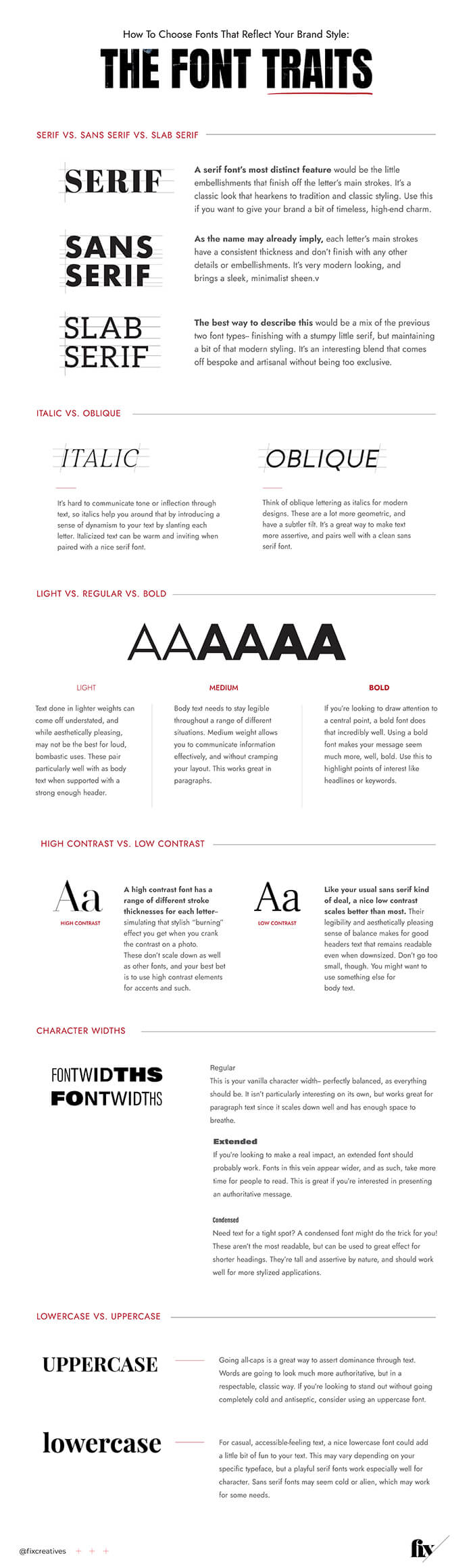
Serif
A serif font’s most distinct feature would be the little embellishments that finish off the letter’s main strokes. It’s a classic look that hearkens to tradition and classic styling. Use this if you want to give your brand a bit of timeless, high-end charm.
Sans serif
As the name may already imply, each letter’s main strokes have a consistent thickness and don’t finish with any other details or embellishments. It’s very modern looking, and brings a sleek, minimalist sheen.
Slab serif
The best way to describe this would be a mix of the previous two font types– finishing with a stumpy little serif, but maintaining a bit of that modern styling. It’s an interesting blend that comes off bespoke and artisanal without being too exclusive.
—
Italic & oblique
Italic
It’s hard to communicate tone or inflection through text, so italics help you around that by introducing a sense of dynamism to your text by slanting each letter. Italicized text can be warm and inviting when paired with a nice serif font.
Oblique
Think of oblique lettering as italics for modern designs. These are a lot more geometric, and have a subtler tilt. It’s a great way to make text more assertive, and pairs well with a clean sans serif font.
—
Light, medium , & bold
Light
Text done in lighter weights can come off understated, and while aesthetically pleasing, may not be the best for loud, bombastic uses. These pair particularly well with as body text when supported with a strong enough header.
Medium
Body text needs to stay legible throughout a range of different situations. Medium weight allows you to communicate information effectively, and without cramping your layout. This works great in paragraphs, especially if you’re using a bold font for the headline.
Bold
If you’re looking to draw attention to a central point, a bold font does that incredibly well. Using a bold font makes your message seem much more, well, bold. Use this to highlight points of interest like headlines or keywords. Looks amazing, but might be too overpowering for regular body text.
—
High and low contrast
High contrast
A high contrast font has a range of different stroke thicknesses for each letter– simulating that stylish “burning” effect you get when you crank the contrast on a photo. These don’t scale down as well as other fonts, and your best bet is to use high contrast elements for accents and such.
Low contrast
Like your usual sans serif kind of deal, a nice low contrast scales better than most. Their legibility and aesthetically pleasing sense of balance makes for good headers text that remains readable even when downsized. Don’t go too small, though. You might want to use something else for body text.
—
Character widths
Regular
This is your vanilla character width– perfectly balanced, as everything should be. It isn’t particularly interesting on its own, but works great for paragraph text since it scales down well and has enough space to breathe.
Condensed
Need text for a tight spot? A condensed font might do the trick for you! These aren’t the most readable, but can be used to great effect for shorter headings. They’re tall and assertive by nature, and should work well for more stylized applications.
Extended
If you’re looking to make a real impact, an extended font should probably work. Fonts in this vein appear wider, and as such, take more time for people to read. This is great if you’re interested in presenting an authoritative message.
—
Upper and lower cases
Lowercase
For casual, accessible-feeling text, a nice lowercase font could add a little bit of fun to your text. This may vary depending on your specific typeface, but a playful serif fonts work especially well for character. Sans serif fonts may seem cold or alien, which may work for some needs.
Uppercase
Going all-caps is a great way to assert dominance through text. Words are going to look much more authoritative, but in a respectable, classic way. If you’re looking to stand out without going completely cold and antiseptic, consider using an uppercase font.
—
Font Styles
Serif fonts
Best known for the flourishes that end each stroke, serif fonts make for interesting bits of typography. These have a range of different thicknesses, ligature styles, and typefaces. They’re known for being particularly diverse in their presentation, due in no small part to their abundance of details.
There is a general air of class and luxury for magazine spreads set with serif fonts. Sure, there’s the legibility angle, but that’s up in the air and subject to debate. One thing’s for certain though, and it’s that serif fonts have vibe for days.
Serif fonts are also known to play well with others, provided they contrast well stylistically. Pairing a good serif font with a matching sans serif solution could achieve a sleek, modern aesthetic, for example.
Sans serif fonts
Sans serif fonts take particularly well to digital settings, and can be used in a range of different applications– say, headers or body text. They tend to provide more of a modern, easily accessible sheen, but can rise to the occasion for bold, assertive displays if need be.
As is the case with serif fonts, picking a contrasting font style leads to some pretty interesting results. If you’re looking to draw interest from one area of your site to another, the play between modern and classic features is something to consider.
Script fonts
Drawing from the incredibly rich tradition of calligraphy, script fonts are an incredibly diverse set of scripts inspired by the lively, flowing strokes found in human handwriting. These convey a level of grace and human warmth that isn’t typically found in most typefaces.
This is great for brands looking to make a more human connection, as scripts are just bursting with personality. Pairing this with sans serif fonts should give you a bit more of a modern feel, while pairing it with a serif font exudes more upscale vibe. Just be careful to not use script fonts for body text, as they’d be too busy to read sensibly.
Slab serif
With traits from both serif and sans serif fonts, a slab serif font is typically sleek and comes with a stubby little detail at the end of each main stroke. These were largely used in print media, and were designed to command attention without being too overbearing.
Slab serif fonts could vary quite a bit, but generally work well for engaging material, and scales well according to your needs. If a serif font is a bit too serious, and a sans serif font, too antiseptic, consider the slab.